Machine Learning of Flight Control
|
|
|
|
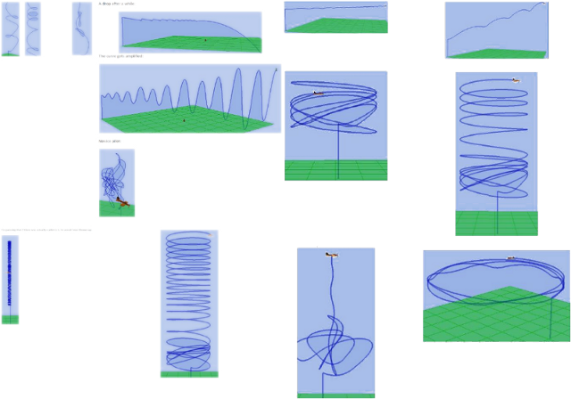
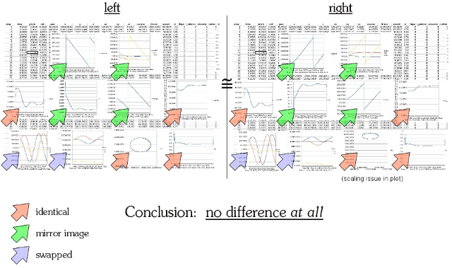
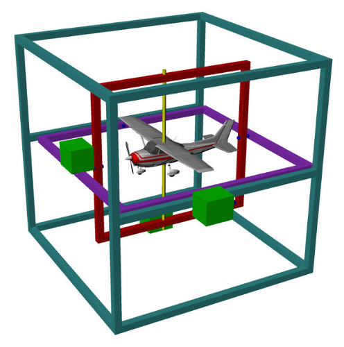
And oddly enough, I found this on the web. My original visualization system was built around 2002 and rebuilt from scratch around 2007. This isn't an exact copy, but when I first saw it, I really thought somebody else was using mine (which would be fine with me, but I was curious because I hadn't made it public to anyone except students).
|
|
|
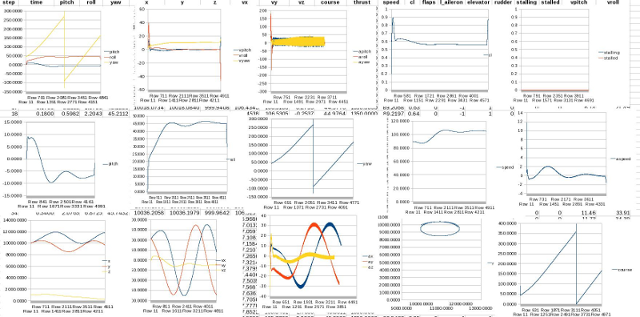
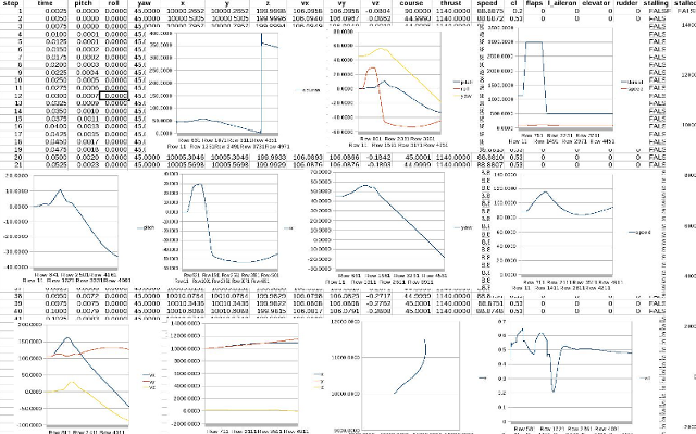
Visualization is great, but for this project in Software Engineering, the explicit purpose was to model and simulate instrument flight, which has no visual component (except the instruments, of course). This required the students to get much more familiar with the problem and their solutions. For example, they had to run experiments on the control surfaces of the UAV and interpret the effects. I provided the spreadsheet with the data template for the graphs. This was a total disaster, but I hope they learned from it.
|
|
|
|
We spent a lot of time (as in all my courses) on modeling and simulation, visualization, scientific method, controlled experiments, data analysis, and so on. A student here made the claim that turning the UAV to the right was "harder" than to the left. This made we wonder because in real life, this is actually somewhat true (it's called P-factor, plus there's the issue of perspective because the pilot sits on the left), but my model doesn't intentionally reflect it. So I ran and explained a simple experiment that showed how we prove this is false.
|
|
|
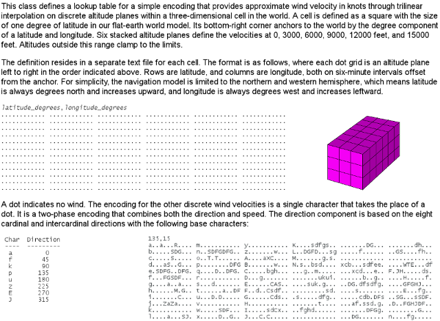
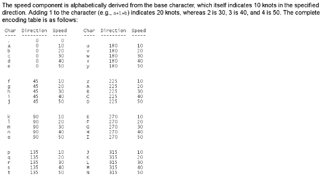
Finally, at least for the software considerations (although there are tons and tons more), there's the wind model. I didn't plan to use this because flying the UAV is hard enough for the students (and me, with the keyboard), but it made a great example of a practical, real-world data structure. This isn't too far removed from how aviation weather is represented and presented.
|
|
|
|
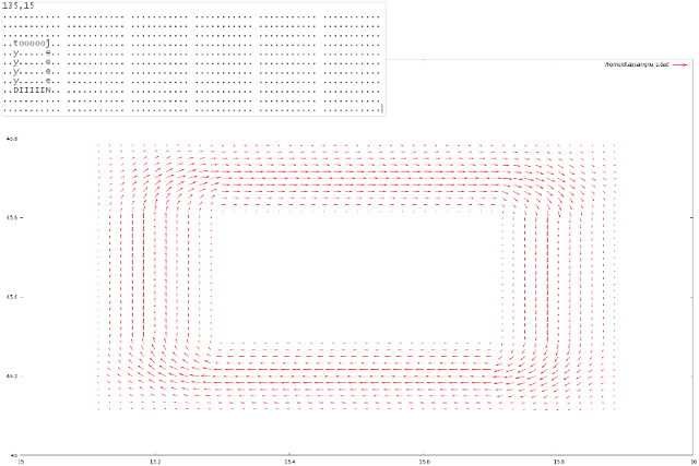
Here's an example from a test (top left) rendered in gnuplot.
|
|
|
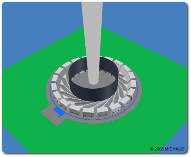
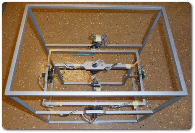
Over on the hardware side, we have this puppy, which has its own page.
|
|
|
|
|
|
© 2026 Dan Tappan and Eastern Washington University
— last updated 27 May 2026 11:43